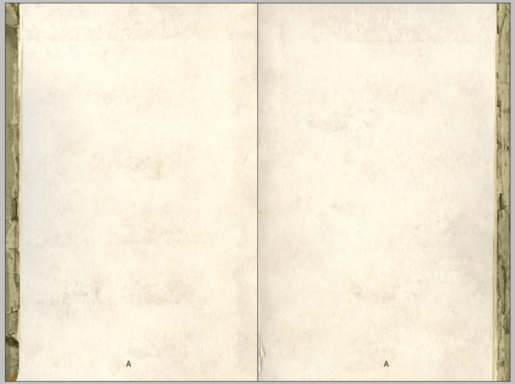
I spend far too much time agonizing over details no one is ever going to notice. This spread for instance, from my GM Advice book, has been edited and edited and edited numerous times. I think I’ve changed tiny little edge creases over a dozen times. Changed the color and flow. Even the font below has changed.

Even now, after maybe six hours of editing, I look at the torn piece near the bottom left and wonder if I should make it simpler, or smoother like the page on the right. Sometimes I want the pages to be uniform. But other times, I enjoy a little bit of chaos.
When I did the graphic design for The Carcass: Exodus, I made 20 different page trims and scattered however I wanted them to appear on various pages. As close as I could, I tried to have no two spreads be the same.
I doubt anyone noticed.
At the end of the day, for me, I know I can make super busy graphic design like I see in so many other products, but these are still rulebooks. I want the text to be legible and later to be reference-able. And the one place I get to tinker around with the ‘artistry’ of my own books is on these sidebars.
Why am I bringing with up here? “This feels like a Facebook post, jim.”
I give advice across a number of channels on the internet. And this feels relevant to new designers needs. And here’s why. There’s a lot of very busy design out there (Mork Borg), and even more under designed work. Just stuff that hurts my eyes to look at and makes me lose interest.
Your page design is your canvas, not your palette. The concept of your page frames/trims/headers/extras is to keep the eye on the page. While I overdo it with details that don’t matter, my main approach is to put side trim (I almost never do trim on the top/bottom) so that the PDF is easier to read. Your eye flows down the page to the next one on the screen.
I also rarely do background textures. I think this is a hallmark of early 2000 roleplaying games where everything was trying to look like a fantasy scroll. This book would be an exception to my rule, of course, but text should never be befuddled or hard to read because of background imagery. Too many times game companies use an overly-harsh, or clearly-digital looking texture that distracts, or brings the overall quality of the work down.
I can’t imagine having someone else lay out my text in their book and it’s a garish representation of what I’ve written.
If you’re a young writer looking to do your own graphic design, I would first tell you to stop using Word Processing programs as layout programs. Second, get yourself the non-designer design book. It will teach you about typography and everything else.
I can’t stress enough the difference just a little effort makes in turning a game PDF from illegible to fun to read.
Lord. I wish I had a better closer than this.