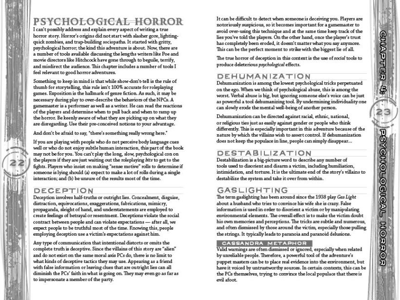
I am a long way from the finish line, but this spread is done. Thought I’d give you a taste of the “advice” portion of the adventure.
Note: I used Ringbearer as the header typeface, which is going against my own rules, but it really is that damn strong. The body is Chaparral Pro, which has so many extra glyphs, I just couldn’t go wrong with it. It’s very strong, as well.
Blah. Blah.


What rule are your breaking with Ring Bearer?
it is slowly becoming the new papyrus…. people are using it everywhere and it’s becoming the commonplace typeface for anything remotely “weird” and people are using it incorrectly, so it looks awful. my hope is that it is a strong showcasing here.
It’s looking great, jim.