Post World Games 2014 Year End Report

11518597-funny-goat-sketch-symbol-of-2015-new-yearNothing like waiting until the last minute. Right?

Okay. Let’s get this started.

First off, I’d like to start with all the thank yous. Thank you to everyone big and small who helped this year. Even if you only bought one pdf, hearing the stories of what people are doing with my games is so much fun. Regardless of the sales/profit/business jargon side of things, the reason I do this is that I get to create games.

And I never get tired of creating games.

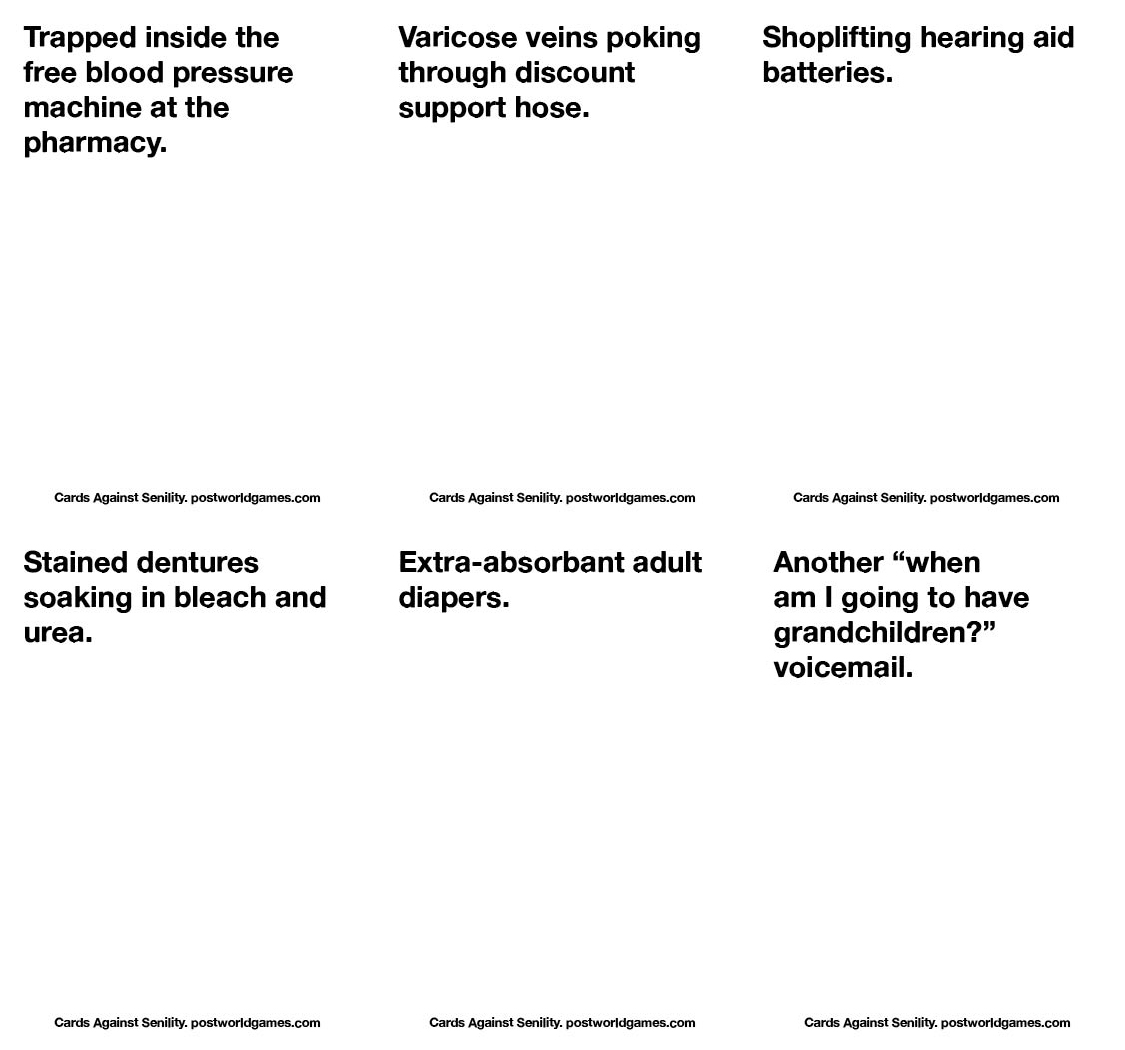
The Protocol game series is proof of these. There are now 40 games in the series. 40. That’s a lot of choices.

Before it’s over there will be 60 of these things. I have no idea if I have anymore in me after that, but I’d love to cap it at 100 Protocol games. How cool would that be?

But, I digress.

Those of you who were around for the 2013 year end report may have noticed that only about half of my plans came true. That said, I released 75 products in 2014 vs. 40 in 2013. So. I’m not exactly sad about what I was able to do.

However, it is true that I’m a little behind on work for those of you still waiting for GMZero and Toolcards 2.

There is a schedule/plan to get these games done. No fear. I might be late, but I will never cheat anyone.

2014 also saw the development of projects with Souljar Games, my other game company with Alyssa, Jack, and Ross. We are already started development on our next two board games, as well as two expansions for Cairn. For those of you not involved with what we’ve done so far, you can check out souljargames.com

So? What’s next?

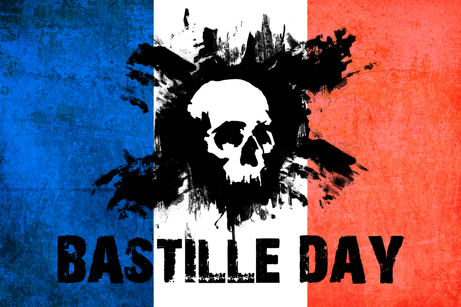
The big plan for 2015 is the Dramatic Game Engine, a new roleplaying game system that I intend to release at least five games with, though not all this year. The first has already been announced — Bastille Day. You can read more about that elsewhere on this page or the internets.

bdlAdditional games using this system involve a scifi game, a game set in the an alternative 1960s America, and a dark fantasy game. I’m keeping the last one under wraps for now.

Mum.

I also have a three game series of ‘society builder’ rpgs coming. They’ve been ready for development for sometime now, it’s just a matter of inventing more hours in the day. The first of the three is called Fairview and it’s set in a post-apocalyptic 1950s America. All three games play the same, but the styles are very different.

But that’s not all.

I still have three more games ready to go: NM156, 151 Minutes, and The Last 12 Hours. I think they need new names, though.

NM156 should be ready in the first quarter, while the other two need more writing. NM156 is an homage to Logan’s Run. 151 Minutes is a hostage stand off game with a gamemaster pitted against the players and the Last 12 Hours is a GMZero game in the style of Pulp Fiction or the Last Seduction.

Damn. I feel like I’m just spitting out information.

I’ve been awake for 22 Hours. So. Forgive me.

Finally, I’d like to announce the first Double Door Prize of 2015. I’d like to honor the amazing two-player game, Longhorn by Blue Orange. This game is everything I like about two-player games. Innovative, fast, tons of replay value, and a thorough understanding of its own design engine. Let’s not forget the gorgeous art as well. And for $20, you’d be hard-pressed to find anything better. It even comes with 45 wooden cows.

Now. I just need to decide which prize icon to send them.

10626324_732841553478879_4860624810857695372_o 10860851_732841586812209_713463098204610858_oWell. I think that’s about it for the 2014 year end report. I’d like to give a final shout out to a few key people who made the year easier. Ruth Phillips, Karen Rucker, Tobie Abad, Timothy Hidalgo, Anthony Moro, Leslie Gilbert, Mike Leader, Rob Adams, and of course Diana Stoll, my rock star.

Have a great new year. I’m taking the first week of 2015 off, so I’ll be gone until the 8th.

Double Door Prize

PrintThis is going to sound strange, because game companies don’t do what I’m about to do. But I don’t usually do what is ‘normal.’

And I certainly don’t care what other game companies do.

Starting in 2015, I will begin offering an award to games that ‘rock my world.’ But I won’t be giving them out in specific categories and I won’t be awarding the prize out at regular intervals. In fact, the Double Door Prize will go to a game that particularly grabs my attention at the moment it does so.

Of course. There will be honorable mentions from the past, such as History of the World and Montsegur: 1244. But I could list games like that all day long.

The fact is, I want to honor games ‘moving forward.’ And since I have no qualms pointing people to games that are good, even if I didn’t make them, I think the Double Door Prize is an interesting step in more hobby ‘synergy.’

Gah. Did I just type the word ‘synergy?’

The Official Statement

The Double Door Prize is awarded to any product in the tabletop gaming milieu that evokes exceptional ideas, execution, and design. Products that inspire and advance the hobby in interesting directions — as judged by jim pinto — are awarded the Double Door Prize.

Why the Name?

Tobie Abad brought it to my attention that ‘pinto’ means ‘door’ in Filipino. Instantly, my mind thought Door Prize and the convergence of ideas happened. Of course, calling it Door Prize isn’t thematic to the adventure hobby, but a DOUBLE DOOR sure is. The logo just sort of happened.

Cards Against Your Face

Just in time for the holidays, I’ve created and released three unofficial expansions to a famous, horrible, offensive, ‘you know what it is’ card game. The cards are print versions, not those ridiculous paper PDF things. Gross.

Each deck has a theme and includes 75 cards (55 white and 20 non-white cards) on premium paper.

cardsagainstcivilityCards Against Civility is themed around ‘those people’ who don’t seem to have manners and fit in with the rest of us. You know who you are. Audi Drivers top the list.

http://rpg.drivethrustuff.com/product/141101/Cards-Against-Civility

cardsagainstcivility94

cardsagainsthumilityCards Against Humility is themed around events and people that/who embarrass us. Grandma kissing you in front of your friends would be an example, though it didn’t make the final cut, though watching porn with grandma in the room did.

Awkward.

http://rpg.drivethrustuff.com/product/140867/Cards-Against-Humility

cardsagainsthumility126

cardsagainststupidityFinally, my favorite of the series is Cards Against Stupidity. This is just the kind of stuff that drives me nuts (and probably you, too). Seriously annoying and stupid things and people. My favorite from the deck is probably people who shave off their eyebrows and draw them back in with a sharpie pen. If you’re going to get one, get this one.

http://rpg.drivethrustuff.com/product/140723/Cards-Against-Stupidity

cardsagainststupidity136Update: Two new decks.

Cards Against Pervertity and Cards Against Senility.

For obvious reasons, I can’t post the Pervert ones, but here’s some Senility for you.

cardsagainstsenility6

More Design Advice: Graphicality

I’m sure there times I’ve reviewed a game, or posted a screed and you wondered, “what is he doing?”

Well. Sometimes I give general game design advice. Or writing advice. Or graphic design advice. And no matter what you are doing, there are specific rules to HOW and WHY you do things. All forms of design adhere to the same rules. There are hierarchies of how information is presented, form and function marrying well, and legibility, among others. Within these rules are various techniques for achieving your ends. Two typefaces might contrast one another, in order to make the information appear different or stand out from one another, for instance.

This isn’t a workshop, so I’m not going to list everything. Just know, that anyone working in design, knows there are rules, even if they don’t know everything there is to know.

(I’m still learning)Previously, I talked about this in how to make character sheets for a roleplaying game. Design is a crucial element, but often character sheets are an after thought. Today, I’m going to use one of my favorite board games as an example of how NOT to design card frames for your games.Ready?Disclaimer: Splendor is a brilliant card/board game. Genius. It did not need a veneer. It is so obviously themeless, that it could have just been numbers on a card. But I think modern eruo-gamers wouldn’t have liked it and wouldn’t have played it if it didn’t have the jewelry leitmotif slapped on it. And it is just slapped on. Again. The game is genius. Go play it.This is what a typical card looks like in Splendor.

splendor1If you’ve read this blog before, you probably know where this is going already.

And here is what this game information means.

splendor2Without explaining the rules, the card cost is the single most important piece of information on a card. It is what you look at for over 50% of the game. Once purchased, the ‘in game bonus’ becomes the most important piece of information on THAT card, but not on ALL cards. Finally, the VP is only important at the toward the end of the game as you need 15 points to win.

The art is never important. It is merely a game affectation.

Now. The first thing I would have done with these cards is removed the art. There’s a small amount of thematic cues to the card based on the card back (level 1 is mines, level 2 is jewelers, and level 3 is cities), but this is mostly superfluous information. But, presuming we keep the art in, the design here is just messy and incoherent.

First off, the art is the largest piece of information and it’s useless.

Second, the other three elements are relatively the same size, positioned in each of the corners, and not all that amazing. Seriously. The typeface for the numbers looks like the first free one out of the box. The in game bonus in the top right is one of five different colored gems. It’s fine for what it does, no complaint, but it doesn’t need to be as big as the card cost icons.When I’m playing the game, I’m looking at three things. How many gems I have (tell me what I can buy), how many gems my opponents have (i.e. what they can buy), and the card cost of each card. And while the information is easily legible, it’s the same size on the card as the other two pieces of information (in order to give room for the superfluous art).

Now. I’ve worked at enough game companies to know that sometimes the art directors aren’t gamers. Or at least, they don’t always play the games. Hell. I’ve been hired by people to make cards without know HOW to play the games. So, I always ask them to provide a hierarchy of information so I know what’s important and what’s not. And I’ve actually dropped out of projects while fighting production managers who didn’t even understand their own product.

(“You’re not selling the art. You’re selling a game.” I would say.)

Now. Had I been hired to make these card frames (and the art had already been ordered, as I presume was the case here), this is how I would have handled the card frame sketch (before doing any real work).

splendor3Notice how the card art is screened behind the information and the card costs are FRONT AND CENTER. This is purposeful. I’ve played the game now, I know what I need to know while playing it. The in game bonus is still at the top right, because that gives me a discount on all future purchases. I definitely want that information handy. And the VP is tucked at the bottom right, because I don’t need that shouting at me.Now. You’re thinking, but if I fan my cards on top of one another, the VP is hidden under the other cards. And you’re right. This would be hurt my ability to play the game. So. I’d make this change.

splendor4Now the VP is at the top left, but at half the size of the gem at the top right. Removing all of my explanatory text, a card frame would look like this.

splendor5Everything in it’s place, everything easy to read, and the art still adding ‘visual texture’ to these abstract game, while not interfering with the gameplay. This is so brain-dead simple, I don’t know why people continue to make games that mess this up.

[Aside: All this card art, and they still ordered a separate piece of art for the cover that doesn’t appear on any of the cards and has zero thematic value. What a waste of money. All that said, it’s selling really well for them. So good on them.]

Okay. So Splendor isn’t the only game that has these kind of headaches.

In fact, I deal with companies all the time who don’t want to spend money on art or icons or anything, but still want to look like Ticket to Ride. And there’s no way to do it with the cavalcade of data that’s sprawled across the game.

Here’s a card frame I made for a game that had almost zero art budget. No lie, I had to order b/w art and make it look like it was colored. I had to use an inordinate about of textures and I had to to present the information in such a way that the card text and icons wasn’t fighting the rest of the game.

fatecards_all-1I won’t defend how the style of this game harkens back to how games were made in the 1970s, but this publisher’s material plays like old school products, so I think it’s a match in that regard. But. Most importantly, it’s clean. Title and art are not important during play. In fact, if I had my way, that information would be on the bottom of the card. But that’s too revolutionary for words. Once the card is on the table, people only have to read one of those columns as the game text in front of them. Everything is explained immediately.

I’m working on a board game here soon called 100 A.D. We’ll be kickstarting it early next year. The game design is mine and the card frame design will be mine as well. The art will be kept to a minimum because the information on the cards is so important to play.

(You’ll see what I mean in a few months.)

But when I do it, I’ll link back to this art and show you an example of me putting my money where my mouth is. In the mean time, stop putting information on card frames in the wrong order.

Thank you.

This PSA brought to you by the Kellogg Foundation, Price-Waterhouse Cooper, and 1d6. Never underestimate the value of designing a game around a dice type that everyone already has.