I’m sure there times I’ve reviewed a game, or posted a screed and you wondered, “what is he doing?”
Well. Sometimes I give general game design advice. Or writing advice. Or graphic design advice. And no matter what you are doing, there are specific rules to HOW and WHY you do things. All forms of design adhere to the same rules. There are hierarchies of how information is presented, form and function marrying well, and legibility, among others. Within these rules are various techniques for achieving your ends. Two typefaces might contrast one another, in order to make the information appear different or stand out from one another, for instance.
This isn’t a workshop, so I’m not going to list everything. Just know, that anyone working in design, knows there are rules, even if they don’t know everything there is to know.
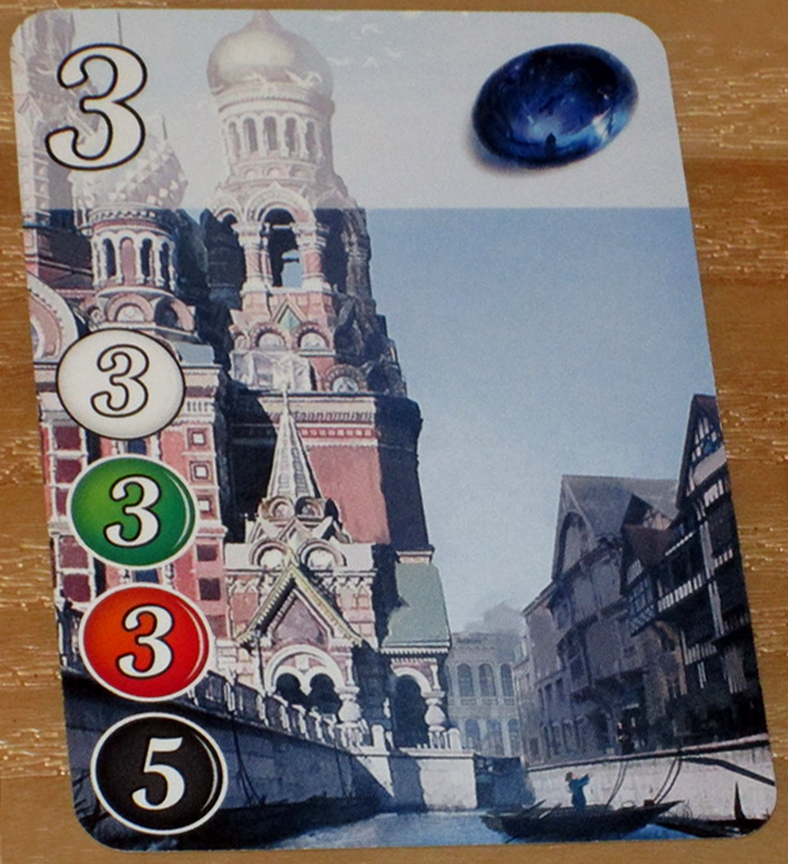
(I’m still learning)Previously, I talked about this in how to make character sheets for a roleplaying game. Design is a crucial element, but often character sheets are an after thought. Today, I’m going to use one of my favorite board games as an example of how NOT to design card frames for your games.Ready?Disclaimer: Splendor is a brilliant card/board game. Genius. It did not need a veneer. It is so obviously themeless, that it could have just been numbers on a card. But I think modern eruo-gamers wouldn’t have liked it and wouldn’t have played it if it didn’t have the jewelry leitmotif slapped on it. And it is just slapped on. Again. The game is genius. Go play it.This is what a typical card looks like in Splendor.
 If you’ve read this blog before, you probably know where this is going already.
And here is what this game information means.
 Without explaining the rules, the card cost is the single most important piece of information on a card. It is what you look at for over 50% of the game. Once purchased, the ‘in game bonus’ becomes the most important piece of information on THAT card, but not on ALL cards. Finally, the VP is only important at the toward the end of the game as you need 15 points to win.
The art is never important. It is merely a game affectation.
Now. The first thing I would have done with these cards is removed the art. There’s a small amount of thematic cues to the card based on the card back (level 1 is mines, level 2 is jewelers, and level 3 is cities), but this is mostly superfluous information. But, presuming we keep the art in, the design here is just messy and incoherent.
First off, the art is the largest piece of information and it’s useless.
Second, the other three elements are relatively the same size, positioned in each of the corners, and not all that amazing. Seriously. The typeface for the numbers looks like the first free one out of the box. The in game bonus in the top right is one of five different colored gems. It’s fine for what it does, no complaint, but it doesn’t need to be as big as the card cost icons.When I’m playing the game, I’m looking at three things. How many gems I have (tell me what I can buy), how many gems my opponents have (i.e. what they can buy), and the card cost of each card. And while the information is easily legible, it’s the same size on the card as the other two pieces of information (in order to give room for the superfluous art).
Now. I’ve worked at enough game companies to know that sometimes the art directors aren’t gamers. Or at least, they don’t always play the games. Hell. I’ve been hired by people to make cards without know HOW to play the games. So, I always ask them to provide a hierarchy of information so I know what’s important and what’s not. And I’ve actually dropped out of projects while fighting production managers who didn’t even understand their own product.
(“You’re not selling the art. You’re selling a game.” I would say.)
Now. Had I been hired to make these card frames (and the art had already been ordered, as I presume was the case here), this is how I would have handled the card frame sketch (before doing any real work).
 Notice how the card art is screened behind the information and the card costs are FRONT AND CENTER. This is purposeful. I’ve played the game now, I know what I need to know while playing it. The in game bonus is still at the top right, because that gives me a discount on all future purchases. I definitely want that information handy. And the VP is tucked at the bottom right, because I don’t need that shouting at me.Now. You’re thinking, but if I fan my cards on top of one another, the VP is hidden under the other cards. And you’re right. This would be hurt my ability to play the game. So. I’d make this change.
 Now the VP is at the top left, but at half the size of the gem at the top right. Removing all of my explanatory text, a card frame would look like this.
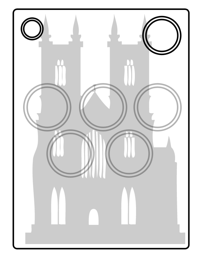 Everything in it’s place, everything easy to read, and the art still adding ‘visual texture’ to these abstract game, while not interfering with the gameplay. This is so brain-dead simple, I don’t know why people continue to make games that mess this up.
[Aside: All this card art, and they still ordered a separate piece of art for the cover that doesn’t appear on any of the cards and has zero thematic value. What a waste of money. All that said, it’s selling really well for them. So good on them.]
Okay. So Splendor isn’t the only game that has these kind of headaches.
In fact, I deal with companies all the time who don’t want to spend money on art or icons or anything, but still want to look like Ticket to Ride. And there’s no way to do it with the cavalcade of data that’s sprawled across the game.
Here’s a card frame I made for a game that had almost zero art budget. No lie, I had to order b/w art and make it look like it was colored. I had to use an inordinate about of textures and I had to to present the information in such a way that the card text and icons wasn’t fighting the rest of the game.
 I won’t defend how the style of this game harkens back to how games were made in the 1970s, but this publisher’s material plays like old school products, so I think it’s a match in that regard. But. Most importantly, it’s clean. Title and art are not important during play. In fact, if I had my way, that information would be on the bottom of the card. But that’s too revolutionary for words. Once the card is on the table, people only have to read one of those columns as the game text in front of them. Everything is explained immediately.
I’m working on a board game here soon called 100 A.D. We’ll be kickstarting it early next year. The game design is mine and the card frame design will be mine as well. The art will be kept to a minimum because the information on the cards is so important to play.
(You’ll see what I mean in a few months.)
But when I do it, I’ll link back to this art and show you an example of me putting my money where my mouth is. In the mean time, stop putting information on card frames in the wrong order.
Thank you.
This PSA brought to you by the Kellogg Foundation, Price-Waterhouse Cooper, and 1d6. Never underestimate the value of designing a game around a dice type that everyone already has.
